Home
Ed Tech Blog
PhysAstro Sims
JS Quiz Maker
More Resources
Consulting
LRQ
Photo Blogs
Ed Tech (& More) by Bowman
Article
Adjusting Web Page Coding for Mobile Devices
Dr. Richard L. Bowman
Education Consultant
Harrisonburg, VA, USA 22802
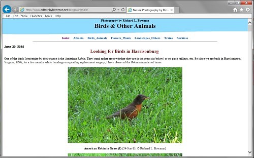
Fig. 1. The way my animal photography blog page looks on a pc.
For more than four years I have been set up my own photography blogs, mainly of nature but also including trains and our experiences while living in Albania. I have lived through the beginnings of HTML and have enjoyed the challenge of understanding and coding it when necessary. (I prefer to use a mostly WYSIWYG web editor but appreciate the challenge of going in an tweaking the code to do what it should.) So I thought a very minimalistic HTML and CSS page would suffice to make my blogs viewable on all computers (and a variety of web browsers) and on all mobile devices such as iPhones and Android devices. However that turned out not to be the case.
HTML 5 is not a coding standard set in concrete, so there does not seem to be one set solution for all devices. But after some informative conversations with our son-in-law, Holden Byler (an IT professional), and a long search of the Internet, I finally came up with some basic coding that seems to fix all the situations I have been aware of. It has both an HTML part and a CSS part, but none of these are difficult to implement.
Begin by looking at one of my web pages that have been corrected to look good on a mobile device.
http://www.edtechbybowman.net/blogs/
Try viewing the above page in a mobile device. Please let me know if you find a problem. Thanks.
A. Adding a Viewpoint to the Web Page and a CSS File
To begin, open the web page you want to work on in your favorite web authoring program. I'll use MS Expression Web 4 for my examples, but any WYSIWYG editor. Look at your web page in code mode. You should see some lines near the top that look like these but not exactly like them.
----------------------
<head> <meta http-equiv="Content-Type" content="text/html; charset=utf-8"> <meta name="description" content="Ed Tech (& More) by Bowman presenting Dr. Bowman's credentials"> <meta name="viewport" content="initial-scale=1.0"> <link rel="stylesheet" href="master.css" type="text/css">
----------------------
Notice the fourth line above (the third meta tag). See if you see such a line in your code. If so, make sure that it reads exactly as this one does. If you do not see such a line, copy this one and past it into your code at the end of the list of meta tags. DO NOT remove any of the other meta tags.
Secondly, look for a line that is a link tag. If it is present make sure to note the name of the cascading style sheet is addresses. In this case it is "master.css", but yours may be different. This line lets the browser know to pull in the css file by this name and to use it to render the web page. The particular code you need to have in this css file will be given in the next section.
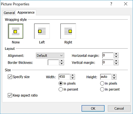
Fig. 2. After deleting the value for the height of an image, many editors add an "auto" value..
If your web page did not have an associated css file until you added the link line in section I above, then open Notepad or some other text editor and past these lines into it. Finally save the text file as "master.css" or whatever you called it (without the quotes, of course). It must end in css.
B. Working with Images
Web editors such as MS Expression Web 4 generally give the precise width and height (in pixels) of any image inserted into a web page. That way, when a browser loads a web page, it will leave an appropriate space for each image until the images are fully loaded. However, on mobile devices, this declaring the absolute size of an image will cause the image to overflow the screen if the image is too large.
When we want is for the image to scale to fit the device. For some reason this happens when there is no height specification. So after inserting an image, right-click on the image and select Picture Properties and then choose the Appearance tab. On this tab delete whatever number is stored in the height box. Close the dialog box, and all will be fine. That is, all will be fine if you have added the code discussed below to the associated css file.
II. Fixing the CSS Page for Web Pages for Mobile Devices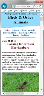
Fig. 3. How the animal photo page should resize and be seen on a mobile device.
To complete the task of making images scale correctly to the width of any and all mobile devices, a few attributes need to be added to the "img" HTML tag through the css file.
Open the css file and add the following code within the dashed lines.
----------------------
img {
    height: auto;
    max-width: 100%;
}
----------------------
Also, since HTML 5 and CSS 3 are still in flux and older versions of Microsoft Internet Explorer may still be in use, the following code should be added to your css file.
----------------------
@viewport{
    zoom: 1.0;
    width: extend-to-zoom;
}

@-ms-viewport{
    zoom: 1.0;
    width: extend-to-zoom;
}
----------------------
III. FinishedThe above changes should fix your web page so that it properly resizes for any mobile device--whether a tablet, smartphone, or whatever.
--Richard L. Bowman; © 2015
Contact Information and Form